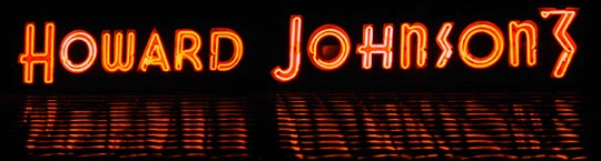
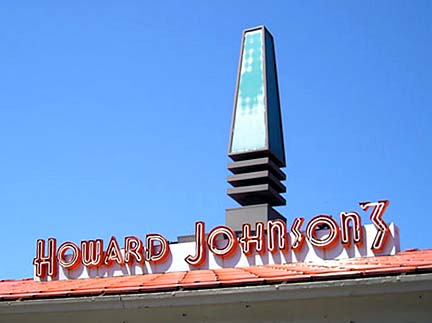
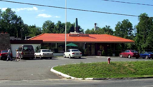
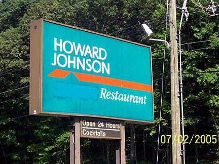
<


Photographs 2004


Waterbury's original 1950s look was updated in the early to middle 1970s, and the Restaurant was "environmentalized." An earth-tone color scheme along with wood planking was added to the exterior of the building. At about the same time, the Restaurant's cupola/weathervane was replaced with the stylized beacon that still peaks its Orange Roof.

Note that the gold Simple Simon and the Pieman figural logo is an early example made of metal and not fiberglass.


Photograph: Courtesy of Byran Gruszka


Photograph 2004
 
 
Photograph: Courtesy of phil Edwards
 
 
Photographs July 2, 2005: Courtesy of Steven LJ Russo
 

Introduced in late 1985 just before the Howard Johnson Company was sold and dismantled, the logo and abbreviated "Howard Johnson" name, seen on the sign below, became standard. Waterbury continued to use the circa 1985 sign and logo even after Franchise Associates reintroduced the apostrophe 's' and its own new version of signage.
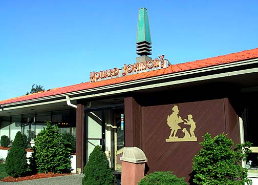
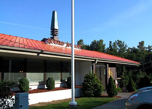
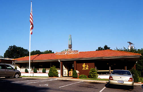
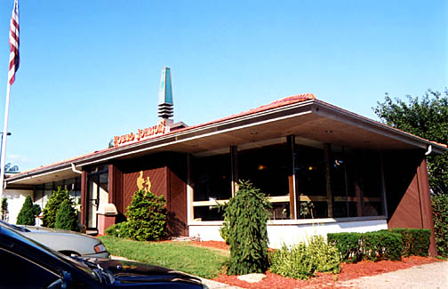
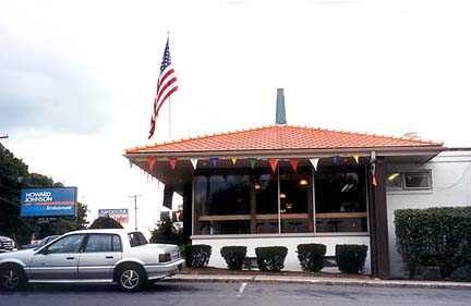
Note that evan as the Motor Lodge had dropped the Howard Johnson franchise in 1997, the sign continued to advertise "Lodge" until it was crudely masked out in about 2003.


<